Mixing colors can be magical, especially when you get it right with acrylic paints. The key lies in understanding a bit of color theory. Everything starts with the primary colors: red, blue, and yellow. These are your foundation, and from them, you can create the rest of the rainbow. Knowing how secondary and tertiary colors emerge from this trio sets a solid base for mixing.
Acrylic paint’s ingredients play a big role in how your colors will blend. It’s not just about pigment. There’s a binder made of acrylic polymer emulsion, which dries to form a clear, durable film. This means when you’re mixing, you’re also working with how these components interact. Pay attention to their transparency and opacity, as these will affect the final look of your color blend. Watching highlights and undertones emerge as you mix can be quite a revelation.
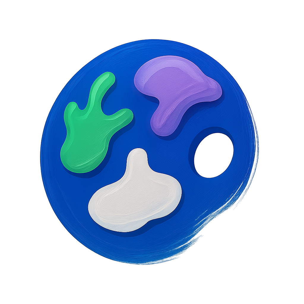
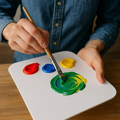
Before you start mixing, it’s worth having the right gear. A palette is crucial for playing around with colors. Palette knives are handy for mixing larger batches, and having a water container helps keep your brushes clean, which is important to avoid unwanted color contamination. Quality brushes make a difference in applying your colors smoothly, allowing for more delicate transitions between hues.
Preventing Muddy Colors: Common Mistakes and Solutions
Muddy colors pop up when unexpected hues emerge in your mix, often turning your masterpiece into a murky mess. This usually happens when complementary colors, like red and green or blue and orange, mix together too much. They tend to cancel each other out, leaving a dull, brownish hue.
Picking colors thoughtfully is the first step to prevent unwanted mud. Stick to a limited palette that harmonizes well together. This doesn’t just make your life easier, it also helps establish a more cohesive look for your artwork.
A well-organized workspace is crucial. Clean brushes and tools after each use to avoid any leftover paint mixing into your new colors. And when you mix, try using a palette knife rather than your brush. This can really give you more control over how the colors combine, reducing the risk of them getting all muddy.
Also, try mixing small amounts of color first. Test your mix on a piece of scrap paper before committing it to your canvas. This helps you see how they’ll appear once they dry and ensures you’re getting the vivid tones you desire.
Managing Acrylic Paint Drying Time: Techniques and Tips
Acrylics dry fast, which is great when you want to quickly build layers but can be a hassle if you need more time to blend colors on your canvas. Temperature, humidity, and airflow all play a part in the drying process, often making everything dry faster than you’d like during a painting session.
Keeping your paints workable for longer on the palette can be achieved by using a stay-wet palette or just misting your colors with a bit of water. For those slow, smooth transitions, a palette that keeps your paint moist can be an artist’s best friend.
If you’ve got some blending you need to work on, try using a medium designed to slow down drying times. Retarder mediums or even specific slow-drying acrylics can give you extra minutes. They aren’t just life-savers, they improve the overall fluidity of the paint, helping you achieve that smooth blend.
Sometimes you want a rapid dry, though, like when you’re layering and texturing. In those cases, don’t shy away from using a hairdryer on a low setting. Just a quick pass over your work can set your paint, allowing you to keep adding and layering without the risk of bleeding colors.
Learning planning and timing with your layers can greatly improve the texture and depth of your paintings. Knowing when to let your paint sit and when to push forward with the next step is an invaluable skill in painting with acrylics.
Creating Tints, Shades, and Tones: Customizing Your Palette
Creating enchanting tints and shades is all about taking your base colors and manipulating them to suit your mood and style. Tints are lighter versions of colors, which you achieve by adding white. Think of it as giving your color a breath of fresh air, perfect for softer, pastel effects.
Shades add depth and drama, achieved by introducing black. But be cautious—black can overpower your colors quickly, so add it sparingly. Sometimes even a touch of dark blue or brown deepens a color in a less intense way, offering you subtle shadows that maintain richness.
The world of tones adds grayscale without losing vibrancy. Gray, made from equal parts black and white, moderates a color’s intensity, creating softer appearances without the stark look of pure tints or shades.
Mixing involves a bit of patience and practice. A controlled approach is best—work with small amounts of color, and build gradually until you get the look you want. Note the ratios you’re experimenting with, as replicating that perfect mix can be a challenge without a point of reference.
Using a color wheel can guide your mix; it helps visualize how your primary colors alter when mixed with white or black, giving a good sense of what to aim for. The wheel isn’t just a tool but a painter’s ally in exploring endless color combinations.
Techniques for Achieving Smooth and Vibrant Color Blends
Getting those colors to blend seamlessly across your canvas can transform a piece from flat to fabulous. Glazing, a technique involving thin layers of transparent color, allows you to create smooth transitions. By layering these glazes, you build depth and luminosity, making your colors sing and glow.
Layering is your go-to for depth and intensity. Start light and work your way towards darker layers. This way, the lighter tones shine through, enhancing the overall depth of the painting. Patience is key here—let each layer dry before adding the next to preserve their individual vibrancies.
Texture adds personality to your art. It’s about more than just color; it adds a three-dimensional effect. Use heavier applications of paint or mix in modeling paste for an additional kick. Don’t hesitate to play with different brush strokes or tools to create unique effects—each stroke adds character.
For quick but smooth transitions, try wet-on-wet blending. Apply a fresh layer of paint over a still-wet background. This technique is great for skies and other gradients where you need a soft, impressionistic touch. Use a damp brush to help soften lines between colors.
Balancing vibrant, clean colors while adding variety in texture and technique keeps your art engaging and visually stunning. It’s less about strict rules and more about finding what feels right for your vision. The more you practice, the more intuitive blending and layering will become.
.